
Catch the Ace
Lottery
The Catch the Ace Lottery is a new fundraising initiative launched by the Thunder Bay Regional Health Sciences Foundation in support of the Our Hearts at Home campaign, which is dedicated to bringing cardiovascular surgery to Northwestern Ontario.
I developed a full branding suite that included the logo, colour palette, website elements, social media templates, and print deliverables, creating a cohesive look and feel that supported the lottery from its launch through ongoing campaigns.
DESIGN GOAL
Establish a clear, recognizable brand identity for a brand-new lottery.
The design needed to feel trustworthy, exciting, and adaptable across digital and print platforms, while also aligning with the Thunder Bay Regional Health Sciences Foundation’s Our Hearts at Home campaign.
INITIAL MEETING NOTES
Fun & Bold
Red for Our Hearts at Home campaign
Should be a cousin to the 50/50 logo, not a sibling
APPROACH
When developing the Catch the Ace logo, I began by studying the visual language of scratch tickets and OLG lotteries to understand what design elements draw buyers in — from color choices to typography and overall style. To maintain brand consistency, I incorporated the Gotham font, already familiar from the 50/50 logo, for the “Ace” portion of the mark.
The logo itself combines a black spade and a red heart, balancing the identity of the Catch the Ace lottery with the Thunder Bay Regional Health Sciences Foundation’s Our Hearts at Home campaign. I deliberately styled the two symbols differently: the spade was designed as a bold, flat, rounded shape to create a clear focal point, while the heart introduced warmth and connection through its vibrant red. One of the key challenges was meeting the draw’s requirement to emphasize the Ace of Spades while also integrating the Foundation’s heart icon — a balance I achieved through careful contrast and composition.
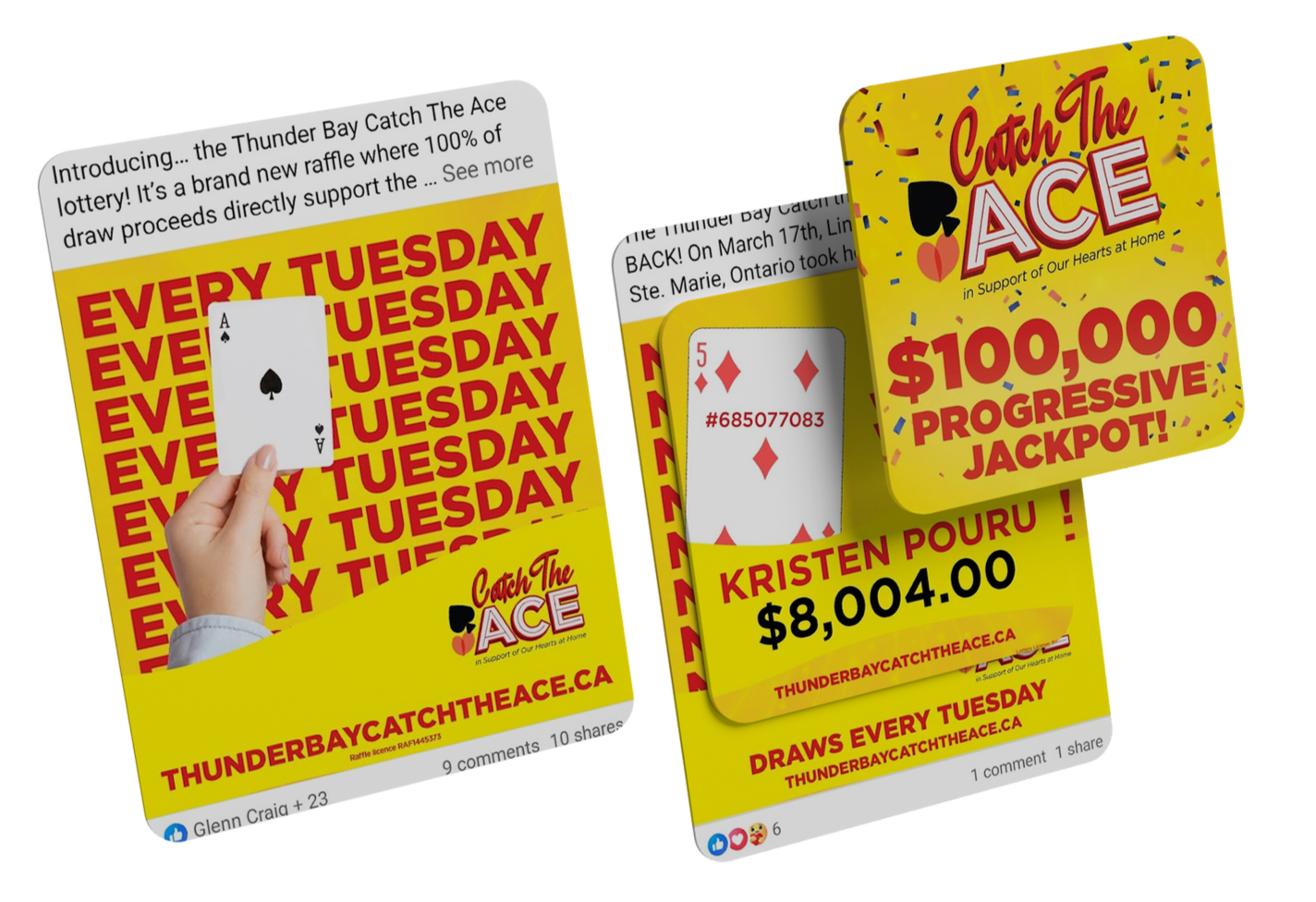
Digital Advertising
To support digital advertising, I designed a series of social media templates that kept the branding consistent while remaining adaptable for different messages throughout the campaign. A bright yellow background was used across the templates to grab attention in fast-moving feeds and create instant recognition for the lottery. Paired with bold typography and the core logo elements, the templates delivered a clean, engaging look that stood out while reinforcing trust and professionalism.
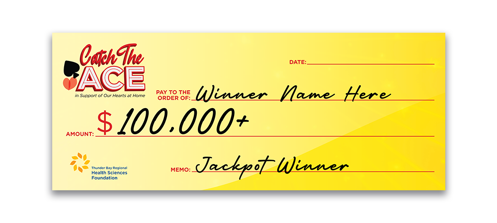
Print Deliverables
In addition to digital assets, I designed a suite of print materials for the Catch the Ace Lottery, including the winner cheque. Each piece was created to align with the overall brand, using consistent colors, typography, and logo placement. The goal was to ensure that every printed element felt professional, cohesive, and instantly recognizable as part of the lottery campaign.
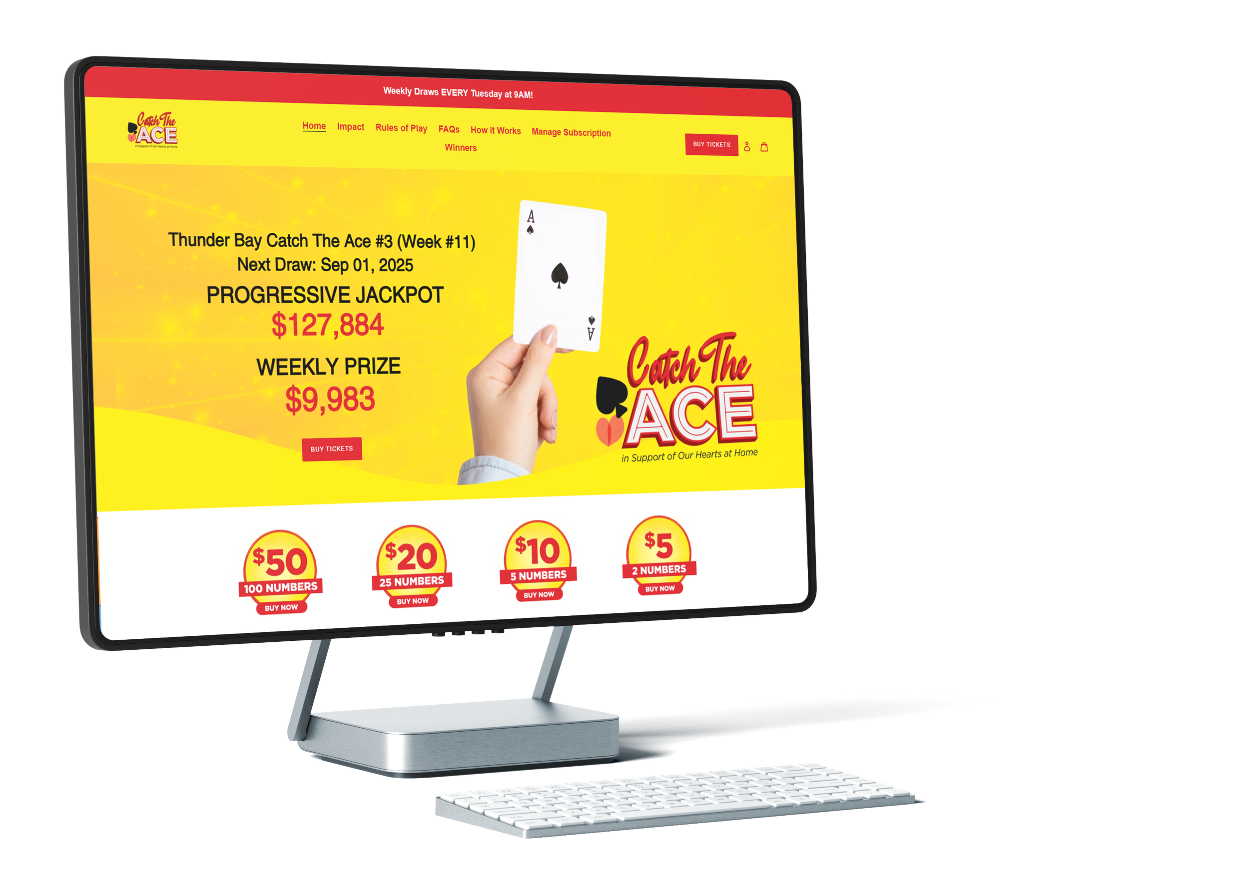
Website
For the website, I worked within the standard Shopify layout recommended by our lottery provider. This meant designing creative elements that fit seamlessly into an existing framework while still making the site feel visually distinct and on-brand. I focused on applying the new color palette, logo, and supporting graphics in a way that enhanced usability, ensured clarity for buyers, and brought the excitement of the lottery into the digital space.
OUTCOME
The Catch the Ace Lottery launched with a cohesive brand identity that carried seamlessly across digital and print platforms. The engaging visuals stood out both online and in print, building excitement and trust around a brand-new lottery.
Since launch, we’ve successfully run two consecutive Catch the Ace draws and are currently in our third, with each jackpot prize growing larger than the last. This continued momentum highlights the strength of the branding and its ability to sustain interest, attract new buyers, and support the long-term growth of the lottery.